Featured Project Phases and Artifacts:
Interviews: Users and Stakeholders
Stakeholder Interview
At the beginning of the project, I met with NPM's Associate Director to gather information about expectations for project outcomes and to set a scope for the project that would be achievable within the short timeline. I informed him about various options for conducting user research and why it was essential to get insight into what NPM's different audiences were engaging with the Center for, and what their goals on its website were.
User Interviews
NPM has a number of audience segments that it serves, so we attempted to reach out to all of them for semi-structured phone or Skype interviews about their experiences with NPM, its website, and email communications received from the Center. We were able to schedule interviews with six users total, which targeted all but one user group. Busy schedules of both our team and the users prevented us from getting more interviews scheduled, but we created an online survey that covered all of the same topics as the interviews and sent it to users who we were not able to interview, in an effort to gather as much information about the users of NPM's website as possible. Questions/topics covered in the user interviews included:
- Have you participated in any of NPM's programs? Which ones, and in what capacity?
- Do you receive emails from NPM or about its programs? Do you find the volume of communication sent by NPM to you reasonable?
- Do you follow any nonprofit/social sector news through websites, blogs, or social media? If so, which sources?
- How often do you visit NPM's website? For what purposes do you visit it?
- When did you first learn about NPM and/or its programs?
- What is the best University-affiliated website that you have used? What did you like about it? What were you trying to do there?
Back to Gallery
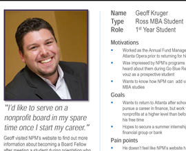
User Personas
Using the information gathered from user interviews, we created personas for the major audience segments for NPM's website, including one new user group that was not currently being directly addressed by the Center's website but still came up frequently in interviews as an important audience - prospective students. I created the persona for the MBA student user group, which is featured here.

(Persona template from Melbourne, as in the city.)
Back to Gallery
Heuristic Evaluations
For this project, our team did two rounds of heuristic evaluations. The first round was done as a quick "first look" at the website using Nielsen's 10 Usability Heuristics for Interface Design with the intention of helping team members who were new to conducting heuristic evaluations understand the process.
The second round was completed after the user personas had been created. Short tasks that each persona would be likely to access the NPM website to perform were written (I hesitate to call them "scenarios" because each was only a sentence or two long), and team members evaluated the website's adherence to Nielsen's Heuristics as they put themselves in the mindset of a user persona and completed the tasks.
Back to Gallery
Final Report
After all interviews, personas and evaluations had been completed, our team came together to identify trends and high-priority issues that could be translated into findings. We then worked to develop information architecture and design recommendations that both addressed our findings and were possible to carry out during NPM's website redesign and/or rebranding. The final report is available below.


