Featured Reports and Deliverables:
Mobile Site Interaction Map
We created an interaction map for the HathiTrust mobile site to detail all possible interaction flows that users could have with the site. This interaction map was created using Omnigraffle.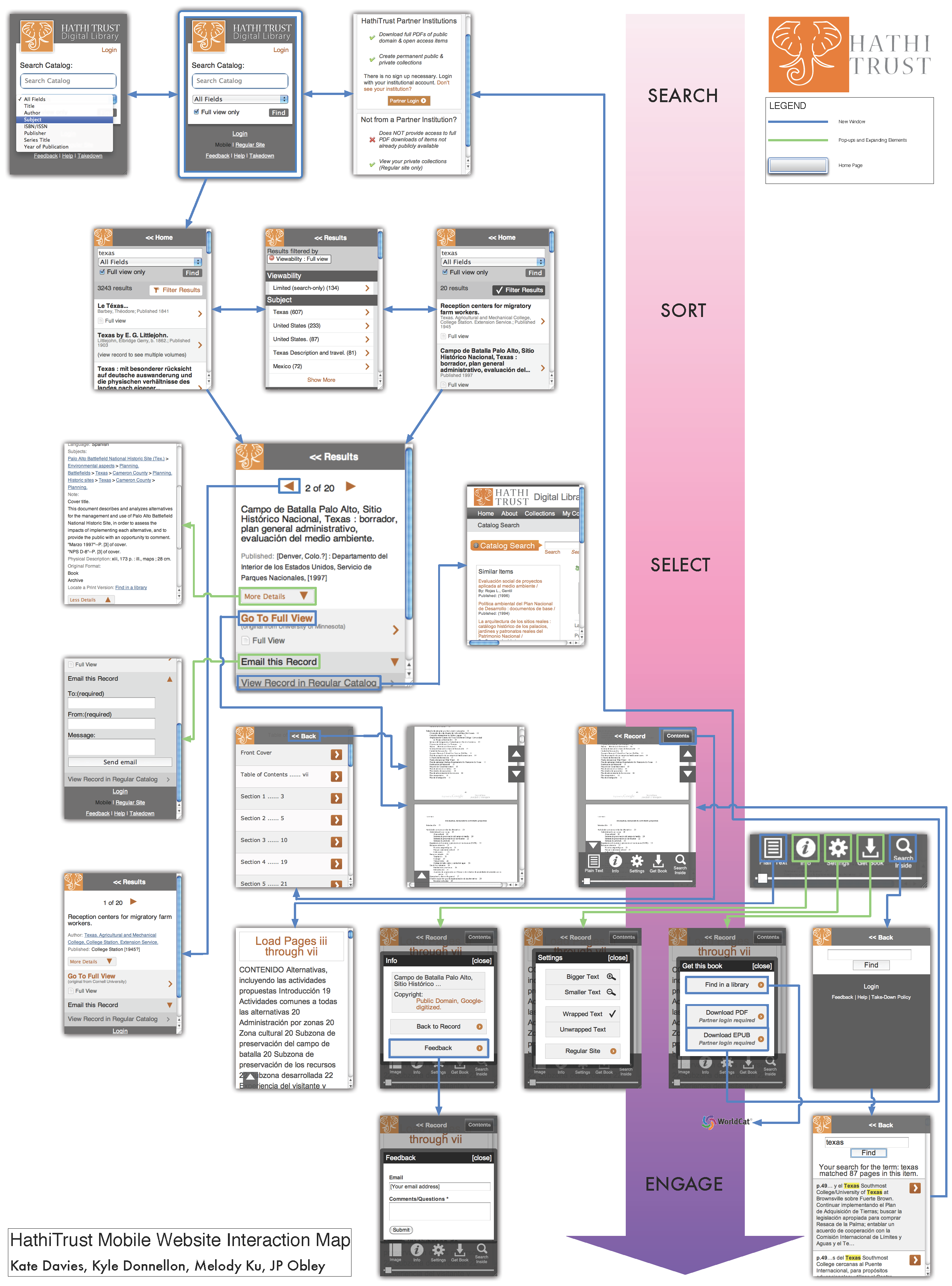
Back to Gallery
Personas and Scenarios
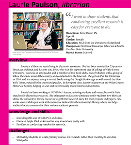
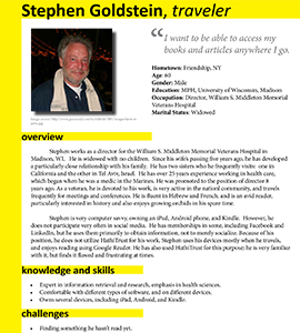
After conducting stakeholder and user interviews, we developed personas to represent the main users of the HathiTrust mobile site. For each persona, we also wrote a scenario describing the nature of that persona's interactions with the mobile site.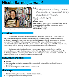
Back to Gallery
Comparative Analysis
We investigated websites and applications that were comparable to HathiTrust's mobile site directly, indirectly, partially, and/or analogously by collecting information about each product and performing general tasks using the products, and compiling the information into a spreadsheet for easier analysis. The result of the analysis was a deliverable in the form of a report that detailed our findings from looking at comparable products and recommendations for how HathiTrust's mobile site could be improved based upon what its competitors are offering.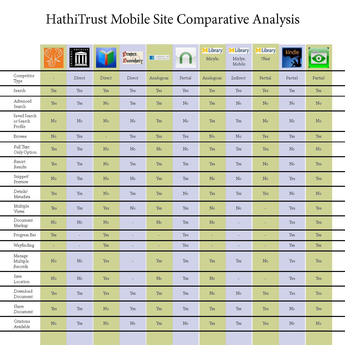
Back to Gallery
Heuristic Evaluation
Each member of our team individually evaluated the client site in detail through the lens of Jakob Nielsen's Usability Heuristics developed in the mid-1990s, but with each team member accessing the client site via different mobile devices (e.g. iPad 2, HTC G2 smartphone). We met as a group to review our independent findings of violations of Nielsen's heuristics, prioritize them by severity of interference with the site's basic functions, and develop recommendations that addressed the most severe of our findings to be compiled into a report for the client.
Back to Gallery
Usability Testing
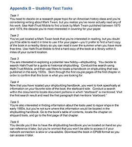
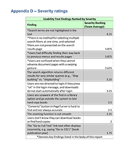
We conducted usability testing with users who fell within HathiTrust's target audience to identify patterns of behavior and/or action that were causing them to have a less-than-ideal experience on the client site. 6 tests were conducted in total, including a pilot study. Each testing session was conducted in-person, where we asked the user to complete each of six tasks on the client site to the best of their ability, using an iPad 2. With permission, we captured the audio and video of each testing session to allow for better analysis after the fact. Each team member took a turn moderating a testing session, handling the recording technology for a session, and acting as real-time note-taker for a session.We analyzed our notes and reviewed the testing footage, and identified a number of findings about how users interact with the website in inefficient ways, and developed recommendations to make the website more user-friendly and intuitive, which we compiled into a report for the client.
Back to Gallery
Final Client Presentation
After all the of the research was conducted to analyze the client site, we went back through our findings from each evaluation method and identified those which were highest priority in terms of how they affected users' interactions with the site or whether they caused the site to stray from its intended purpose of being a leaner, convenient searching, browsing and reading application for HathiTrust members.We compiled these final findings and recommendations for how to solve or improve upon any problematic findings into a presentation that was given to the client.
