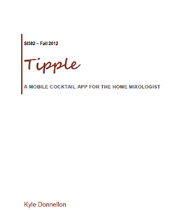
Featured Project Artifacts:
Sketches: Brainstorming, Design Concepts
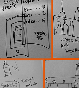
Presented here are examples of sketches I did throughout the design process, to first help define the design problem, then visualize potential interactions and solutions, and various iterations along the way.Initial Concept Sketches
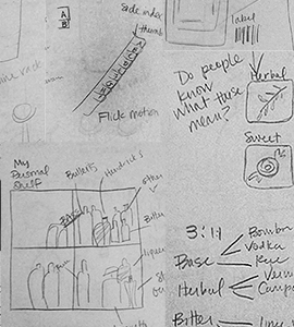
40 Design Solution Sketch Exercise
We were asked to come up with 40 different "solutions" and/or interactions that addressed our design problem.
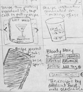
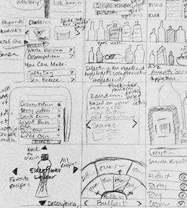
Group Brainstorming Sketches
Back to Gallery
Scenarios and Storyboards
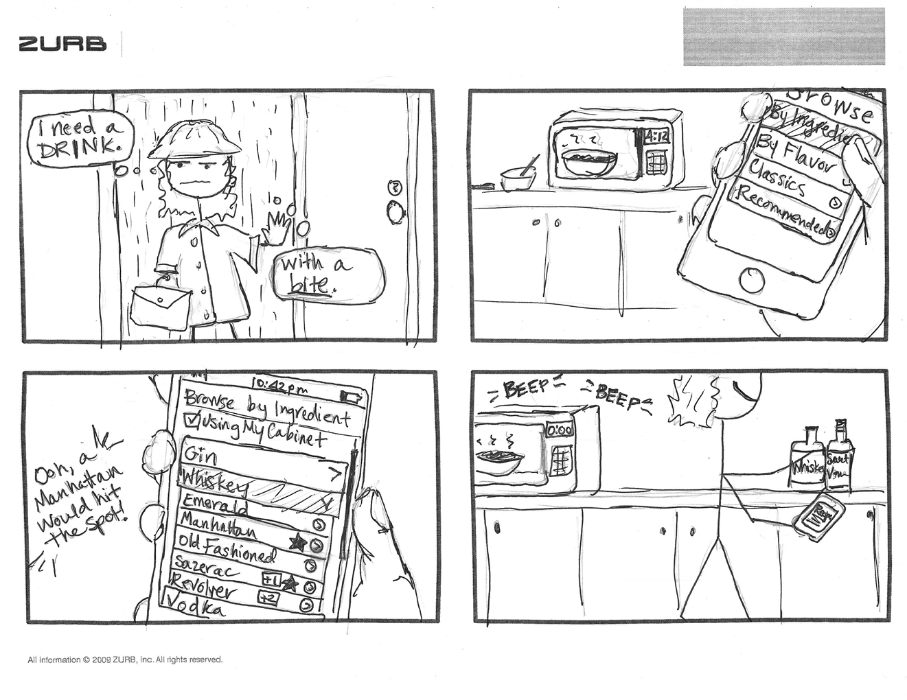
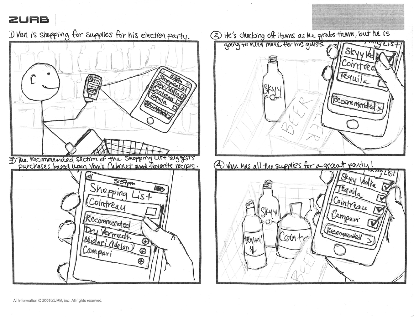
In order to help guide design decisions and maintain a focus on the design problem throughout iterations, I wrote several task-based scenarios that described the user's sequence of actions with Tipple in order to complete his or her practical goals. I also drew up storyboards to illustrate several of these scenarios and show how a user will interact with Tipple when completing tasks.Scenarios
Finding Inspiration Quickly - Jennifer unlocks the door to her apartment, and trudges in, hanging up her wet jacket and pulling off her soaked boots in
the entryway. It’s been a long day at work. Heating up leftovers for dinner and curling up with a drink and watching a movie
is about all her mind can handle at this point. With her dinner heating up in the microwave, she turns to the question of what
to drink. She grabs her smartphone from the counter, and opens up the cocktail app. The ghastly weather outside has put her
in the mood for something with a bite. She starts browsing for recipes and sorts by base ingredient. Scrolling through the
Whiskey section, she spots the Manhattan recipe, decides that would hit the spot, and what luck! She has all the ingredients.
She grabs the Old Overholt and vermouth bottles out of the cabinet as the microwave goes off, telling her that dinner is warmed.
Getting Organized - Lucille is on a mission to get her house organized. She’s cleaned out her closet and donated a bunch
of stuff, freeing up a ton of space as well as allowing her to make a mental inventory of the remaining clothing, as so much of it
was forgotten in the back of the closet. The next step is the pantry. As she pulls all of the bottles out from the shelf holding
her liquor, she scans the barcodes of each to input it into the virtual liquor cabinet on her new cocktail app. She sighs as she
scans the third bottle of Triple Sec, knowing that keeping inventory and using what she has on hand will prevent her from buying
multiple bottles of the same thing in the future. After scanning one bottle, the phone vibrates. A message on the screen says
“Item not found. Please enter this ingredient by name.” Confused, she looks at the bottle and realizes it contains Indian dark rum
that she bought on a trip abroad last summer. Since the brand name is one that she will never remember by name, she just types “Rum”
on the keypad. An option for Dark Rum pops up, and she selects it. She sets the bottle down, and picks up the next one for scanning.
Storyboards
Back to Gallery
Paper Prototype
Based on my design problem, brainstorming and early sketching, as well as identification of constraints, I created a paper prototype of Tipple (then unnamed) out of index cards and Post-It notes, with a focus on the interactions required for users to complete the major tasks that I was designing the application for. Below are some images of the paper prototype's screens, along with excerpts from the brief that discusses the design decisions that led up to this point.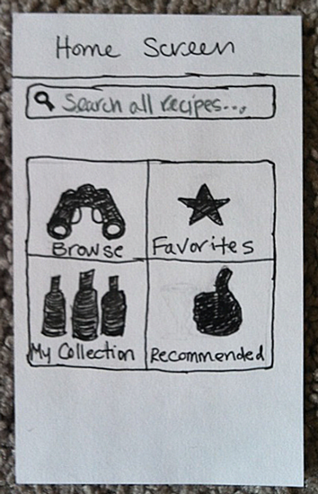
The home screen features a stripped-down interface with four navigation buttons and a search bar. The layout draws from several earlier sketches, where I tried to develop a menu that would allow the user to jump to the most important functionalities as well as get into the recipe content as quickly as possible. Keeping the labels and icons simple is an attempt to make the choices intuitive for the user. I was easily able to decide upon three of the main menu items (Browse, Favorites, My Collection), as those provide access to the major practical goals of the application (finding recipes, inputting/keeping inventory of one’s personal collection of ingredients and quickly accessing known recipes). The fourth menu item was more difficult for me to decide upon. I selected Recommendations, because it fulfills several of the criteria for the app’s interactions – quick (access to recipes), recalls user preferences (recommendations are generated based upon user’s cabinet ingredients and favorite recipes), and delightful (provides users with new recipes to try out).
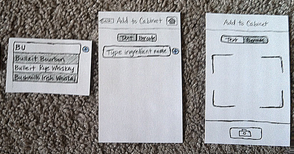
One of the tasks targeted by this prototype is inputting ingredients. I decided to give the user two options for inputting ingredients: text entry with autocomplete and a barcode scanner. Barcode scanning offers fast entry (particularly when the user is trying to do the initial entry of his entire collection) through an efficient and delightful interaction with the application. Text entry is a more traditional method of input, but the autocomplete feature will speed up the process for users. Text entry has the additional benefit of accounting for ingredients that may not be within the app’s database, or users who wish to enter generic ingredients rather than brand names. Users are presented with the text entry as the primary input option, but can switch to the barcode scanner using the toggle button on the screen.
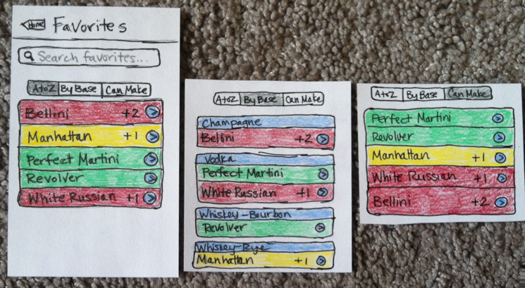
Another task addressed by the prototype is deciding upon a recipe. Developing a workflow for this task led me to a different question addressed in my design defense that came out of a brainstorming session – how substitutions are suggested by users. Within a list of recipes, each is color-coded – green (user has all ingredients for recipe), yellow (user has most ingredients but has an acceptable substitute for those he doesn’t), or red (user needs ingredients to make this recipe). Yellow and red recipes also indicate the number of ingredients needed to make the recipe as written. I believe that this recipe-specific information, in addition to the multiple facets offered for users to browse by, will make the decision-making process much faster and enjoyable for users.
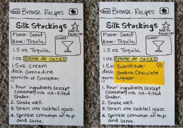
Continuing the color coding idea, on recipe pages where the application indicated that the user could make this using some substitutions of ingredients he has on hand, the ingredient list highlights in yellow those which need to be substituted. When the user selects that ingredient, he will see a pop-up screen showing what ingredients in his possession he can use as a substitute. After closing the pop-up, the recipe's ingredient list will now show the substituted ingredient in the correct quantity, making it easy for the user to follow the recipe as he mixes a drink.
Back to Gallery
Medium-Fidelity Prototype on HotGloo
The final stage of the application design for the class was a medium-fidelity prototype. I created the Tipple prototype using HotGloo, a web application for creating wireframes and prototypes. The interactive prototype allows you to navigate through Tipple and see the planned interactions for adding ingredients to the user's personal cabinet (via barcode scanning or text input), browse for recipes along a number of facets, review a list of relevant recipes and make a decision about which drink recipe to make, and if substitutions are required, see what they are and change the recipe accordingly. The prototype can be accessed here, or by clicking on the thumbnail of the home screen below.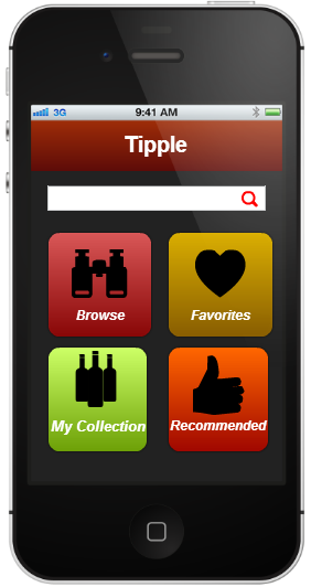
Back to Gallery
Final Report and Design Defense
I wrote a final report about Tipple that discusses the project from start to finish and defends my final design decisions. The report also includes screen captures of the final medium-fidelity prototype that is hosted on HotGloo.Tipple - Final Report
